Project 3- Art Gallery at King St, Newtown
Site Map
(Green pointed arrow indicates my proposed site)
Site Map
(Green pointed arrow indicates my proposed site)
Site that I've chosen
I found that the site is in strategic location. There are few reasons why I've chosen this site:
1. Convenient:
There's a bus stop opposite the building. Buses will stop right in front and will draw those bus passengers' attention. Visitors also able to stop their cars at the nearest carparks which are not far away.
2.Surroundings:
Various restaurants located along the streets. Visitors may stop by and take a glance at the art gallery after having their treats.
3. Adjacent buildings:
The height of two shops in between are relatively lower than the proposed site. Able to utilize the side by adding windows.
4. Rear Land:
Easy to access and to load art works conveniently. There's a mini park at the behind. It becomes a scenic area for visitors and the owner.


The art dealer will be dealing with Contemporary craft and design which are ceramic and glass work. These two types of art works will not be easily damaged if they were to expose to abundant of sunlight.

Exterior & Interior Perspectives
Images below showing how visitors attracted to the art works from the front glaze facade. It's noticeable where visitors get to walk down and up through the stairs and the display of artworks at the level1 storefront.
The building has integrated with a commercial art gallery and also to serve as a living apartment unit for the dealer to work and live. My perception of this design is to divide two different spaces into public and private usage. Soon I've developed my idea and came out with this concept-integration.
1. Public / Private
2. Gallery / Home
3. Formal / Personal
4. Concrete / Timber
These pairs above provides a ''play of opposites''
I've picked two types of material to suit and provide functional to this building. Grey concrete material can be commercialized and its flatten texture able to make these art works to stand out vividly. Timber gives the sense of intimacy and cozy feeling which is suitable for a living area. When two different kinds of material meets, it gives a very strong contrast. The living unit area has its own private stairs and access where the outsiders are prohibited to enter. Wide windows are inserted to the bedroom and living room to overlook the mini park at the rear.
My design scheme uses a linear idea, with the structure adjacent to a full-length courtyard. There are 3 courtyards available in this art gallery which are at the front, center and the rear. It's flexible for an art dealer to change the art works from these 3 courtyards.


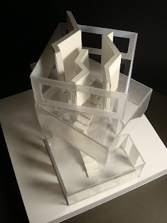
An overhang roof, created a pocketed elevations that are sheltered from the summer sun. Thus it forms strips of lights and shadows at level 2 and partly at level 1. It's clearly seen from the section model, showing the contrast of shadows, bright to dark and from dark to bright.

There's an entry at level 1 in between the art gallery and living unit area. The kitchen is situated at level 1 where the dealer could provide some treats and drinks for certain occasion easily. Every floors of the art gallery is not completely enclose. One's could overlook from level 1 to ground level or from level 1 to level 2. These 3 levels able to tie together and form an interrelate and connectivity space.


Ceiling heights are played at the ground level. High ceiling at courtyard welcomes and gives the sense of celebrations. After passing through the courtyard, will lead you into the a low ceiling height art gallery room. It brings you from huge, spacious space into an intimate space. The level of ceiling plane defines a path of movement through it and articulate zones of space within a room.

Image below shows the rear access for visitors. A long strip of glaze supported by series of beams to allow partially sunlights admit into the rear passageway. It does serves as a shade on the other hand. Furthermore, skylights able to penetrate into the ground floor and gives glow to some of the art works at the middle courtyard and becomes more conspicuous.


